Trick | How to show Pyramid chart in Web Intelligence Reports (SAP BusinessObjects)

How beautiful it looks like if we add these Pyramid charts in Web Intelligence reporting and get a response “WOW!!!”. Let’s check how we can make the webi report more colorful and lively.
( There is no Pyramid chart component provided in Web Intelligence BOXI 3.1. I will make it clear that I am not adding a chart component but trying to do a workaround to show data in that that format.)
Let’s start.
Here is our report output. Data tells Quarterly Revenue for current
year and previous year.

This is one sub-set of report that we will try to give a dashboard look. Since our yearly quarters is a fixed number so for any year, we have fixed 4 quarters.
Steps:
- Create an image with Pyramid having 4 sections since we know, we have fixed quarterly sections.

- Set the image as background image of the report.
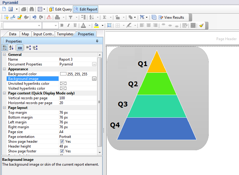
- Add blank cells for each Pyramid section and put the formula. In our case:-=[Revenue] Where([Year]="FY2000" And [Quarter]="Q1")

After adding these free standing cells, if you view the result, it provides a feeling of chart with data values on each section. I am adding another Pyramid for Last year revenue, that will do side by side revenue comparison. So I have placed another graph in my image.

Few other images that I have used in some user reports are below:

For using images as background, we must have fixed number of
rows and columns otherwise values may overlap or go out of image scope.
We know that Web Intelligence is a reporting tool, not a
dashboard design tool. We cannot and should not expect jazzy output but
sometimes, we use Web Intelligence and trying to give a look & feel of
dashboard. In those scenarios, these tricks become more helpful and serve the
purpose.
Let us know your feedback and comments. If you want to share other reporting tricks, feel free to share with us.
Thanks
Dhyan


0 comments:
Post a Comment